kimdeokhwan3@gmail.com
From graphic ideas to images, objects, spaces, and screens.
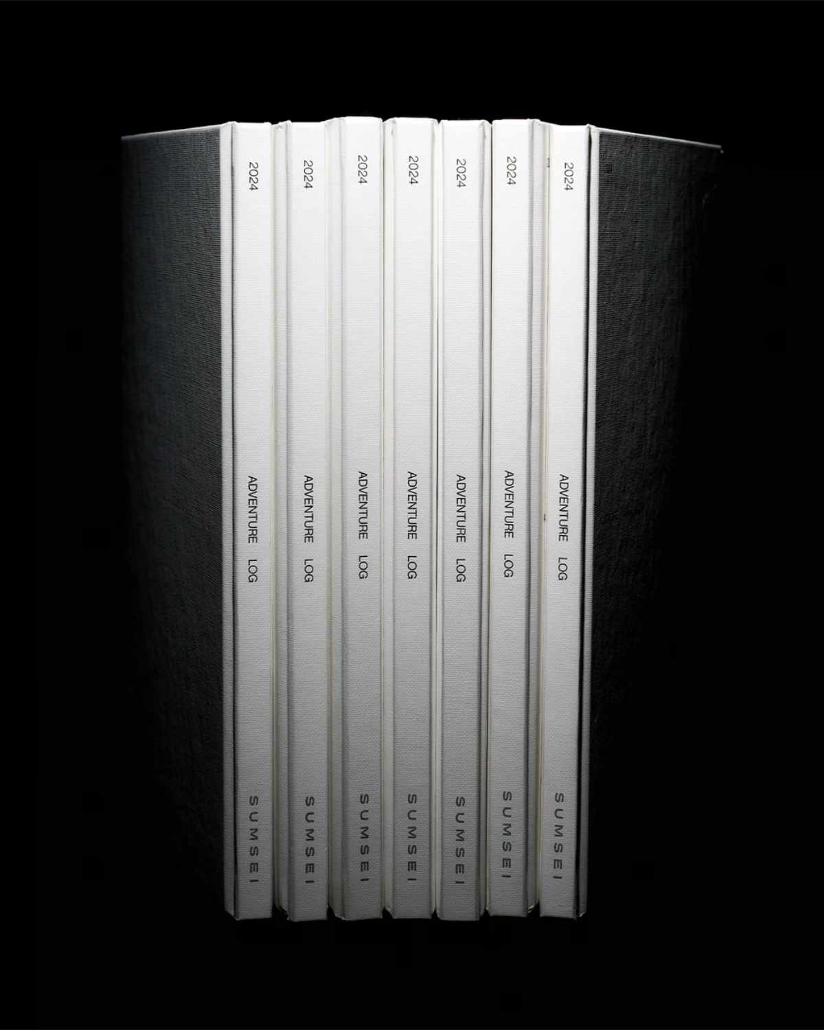
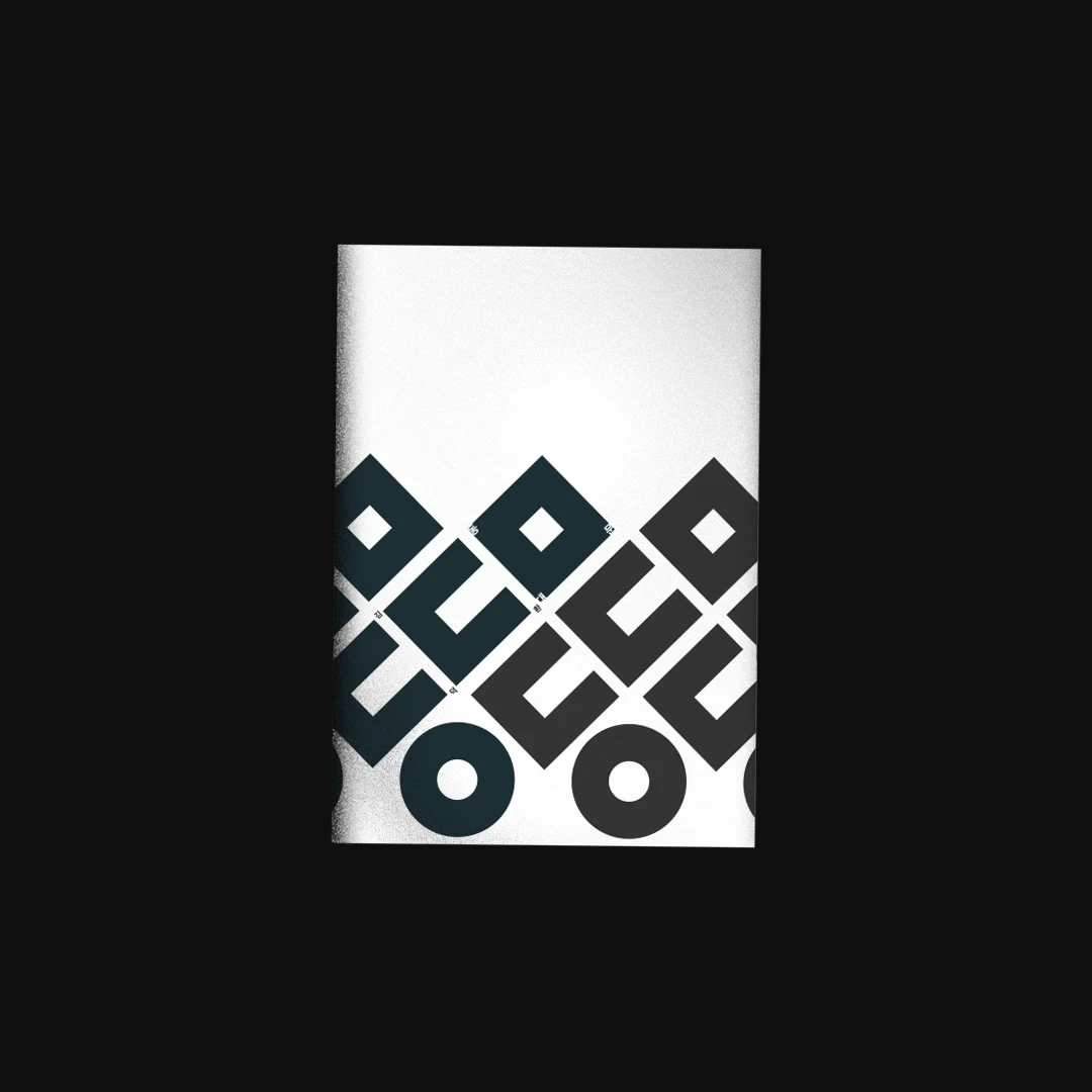
An annual archive for Sumsei, combining textured paper, hardcover binding, black and silver foil, and silver spot-color printing. The cover takes the form of a filed record: a clean white surface, and small typographic cues that reveal themselves on closer inspection. Textured paper, hardcover binding, black and silver foil, and silver spot-color printing extend this sense of collectability.

Film photography printed on chiffon fabric. Merchandise item for Gongjoongdosie.

A concept identity for FOLKES, incorporating ginkgo leaf forms into the stems of a serif wordmark and its accompanying symbol to frame contemporary craft through the sensibility of autumn. Started visualizing the brand by setting the concept of “Select shop founded by novelist”. Offering unique collection of props curated globally, the brand brings handcrafted objects made from natural materials and traditional techniques, curated by novelist. A logo for FOLKES was designed with the theme of balancing refined curves with crisp serif edges and ginkgo-inspired split terminals. Natural forms soften the wordmark’s structure, lending it an understated elegance with a subtle, classic French sensibility.

Paper stock and print production were considered as part of the design rather than a finishing step. A business card for Sumsei, balancing typographic density, the proportions of empty space, and the feel of paper to express the brand’s sensitivity to detail.
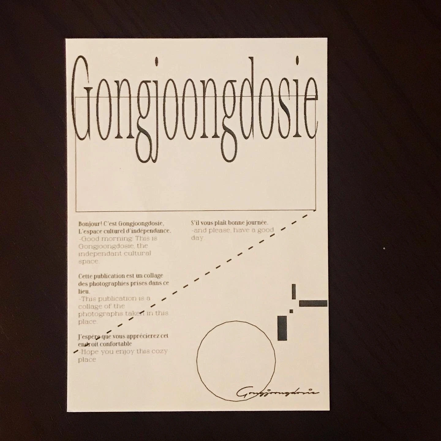
Decorative poster design for entrance of the cafe.
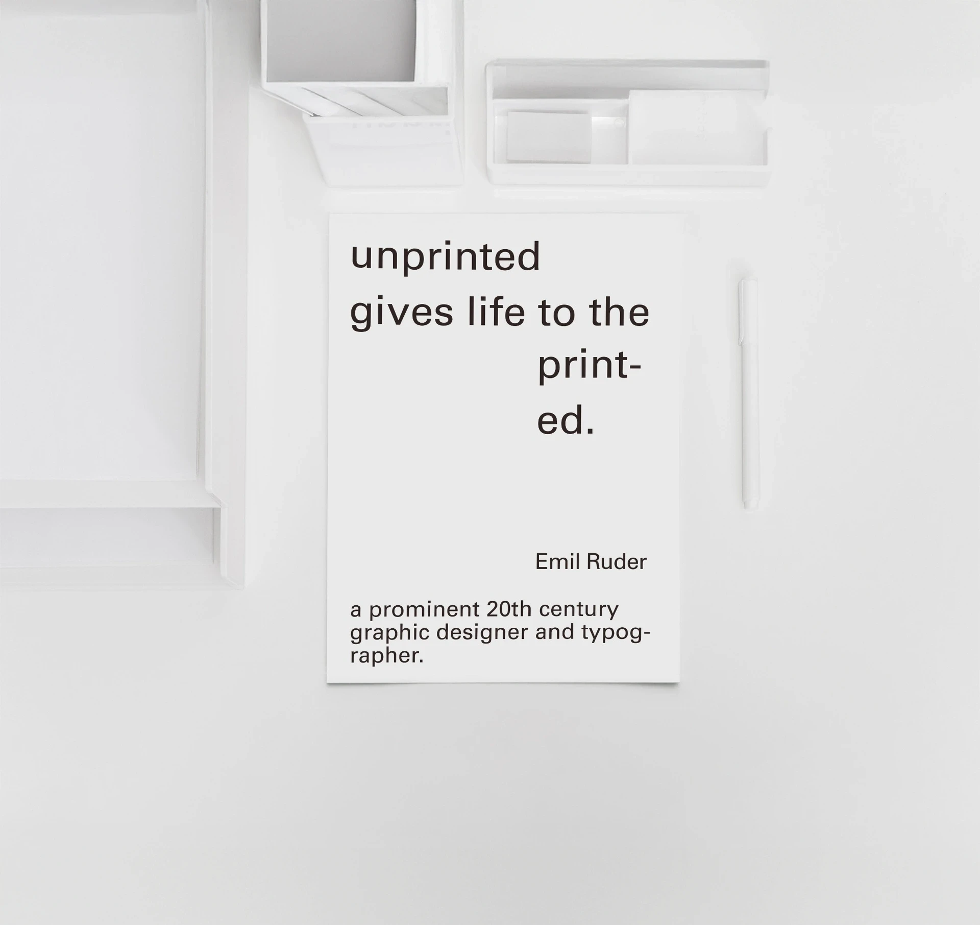
Typographic poster series honoring Emil Ruder, 20th century typography designer. Quoted texts from the book "Design is Attitude" by Helmut Schmid, student of Ruder.
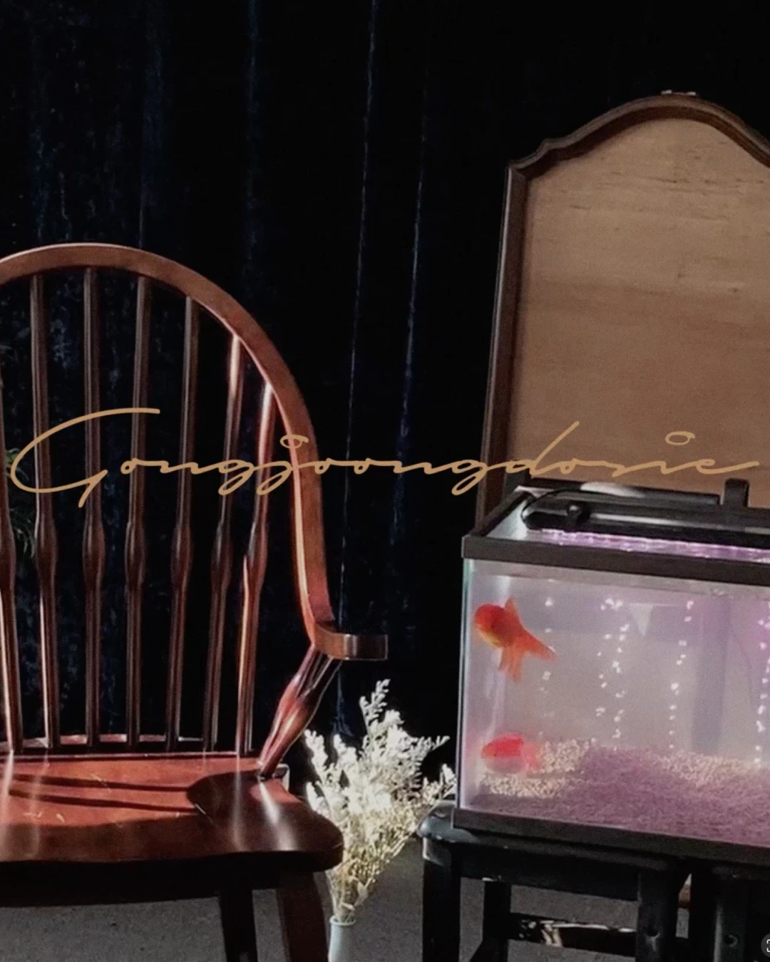
The identity for Gongjoongdosie began with the afterimage of the place—dark wood, glassware, curtains, goldfish tank, an old television, and vintage records. A hand-scripted Roman wordmark was inspired by the bronze objects and curved furniture in the space, referencing classic European Art Nouveau style. The vertical Hanja mark was developed from Hong Kong films and early digital devices, evoking the atmosphere of being in the midst of an old film scene. Together, these two visual languages turn a visit to the cafe into a cinematic experience, where every object becomes part of the mise-en-scène and every visitor a character within it.

A website design contribution for Somaon Yoga. A warm neutral palette, restrained typography, and generous spacing create a visual rhythm that mirrors the focus and unhurried pace of practice. Built as a flexible system of typographic rules, module components, and visual guidelines, the site creates a clear and consistent home for Somaon’s evolving practice.
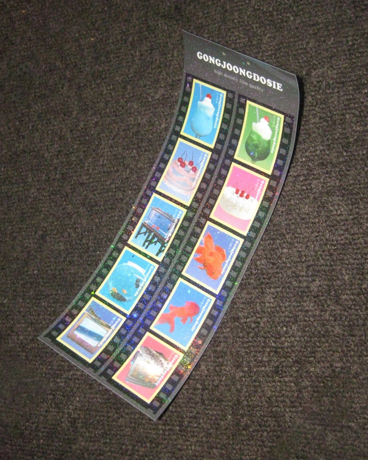
Graphic design for merchandise item of Gongjoongdosie. 10 stamp-sized glitter coated sticker pieces were arranged within a frame shaped like a roll of film. They were designed as small keepsakes, preserving the space’s cinematic, film-like moments.

A5-sized mini photo lookbook of Gongjoongdosie, composed from film photographs of the cafe interior space.

Poster design for outdoor signage of Gongjoongdosie.
13 words were chosen that are related to the town, and edited into graphic using the initial consonant of the word in Hangeul, Korean letter.

Graphic design on color lighter merchandise. UV print on plastic surface.

Business card and typography setting for Studio GA.ZE. Printed identity application, typographic layout, information hierarchy, paper texture, and tactile brand expression.
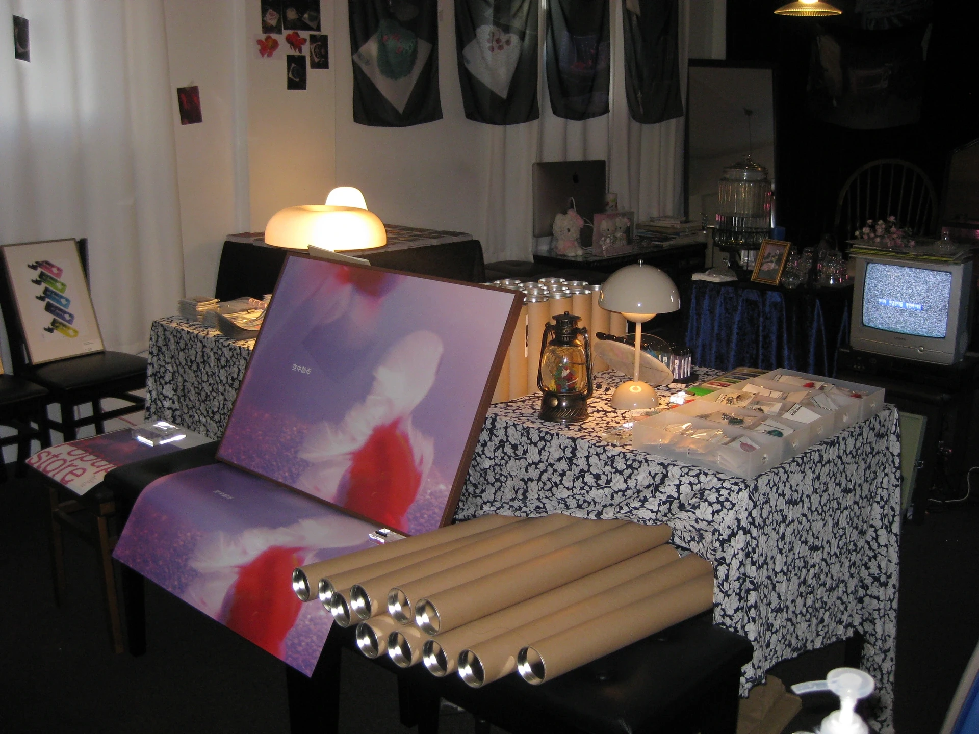
A pop-up space for Gongjoongdosie, translating eclectic atmosphere into a temporary setting through vintage furniture, found objects, graphic signage, and merchandise display.
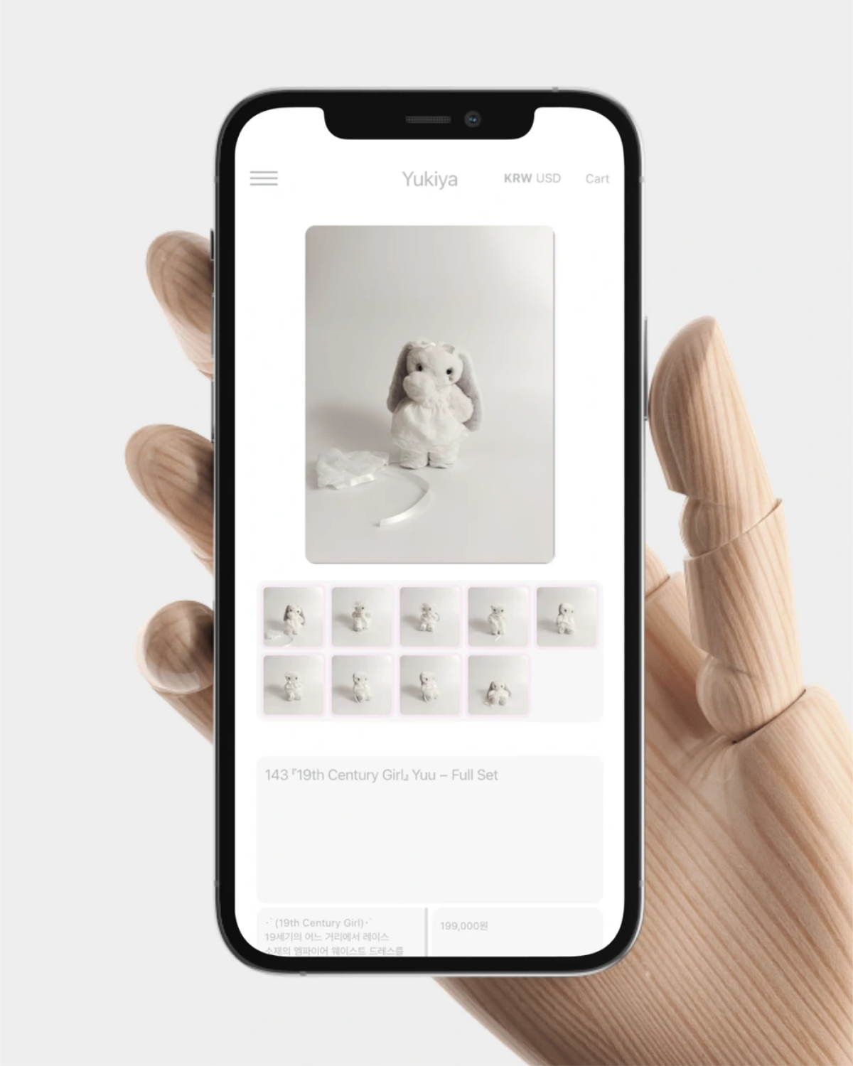
Inspired by Polaroids, photocard frames, and Tamagotchi-like proportions, the website reflects Yukiya’s playful character. A muted color palette conveys its quiet, innocent inner world through web interface design, interaction concept, and photography direction.
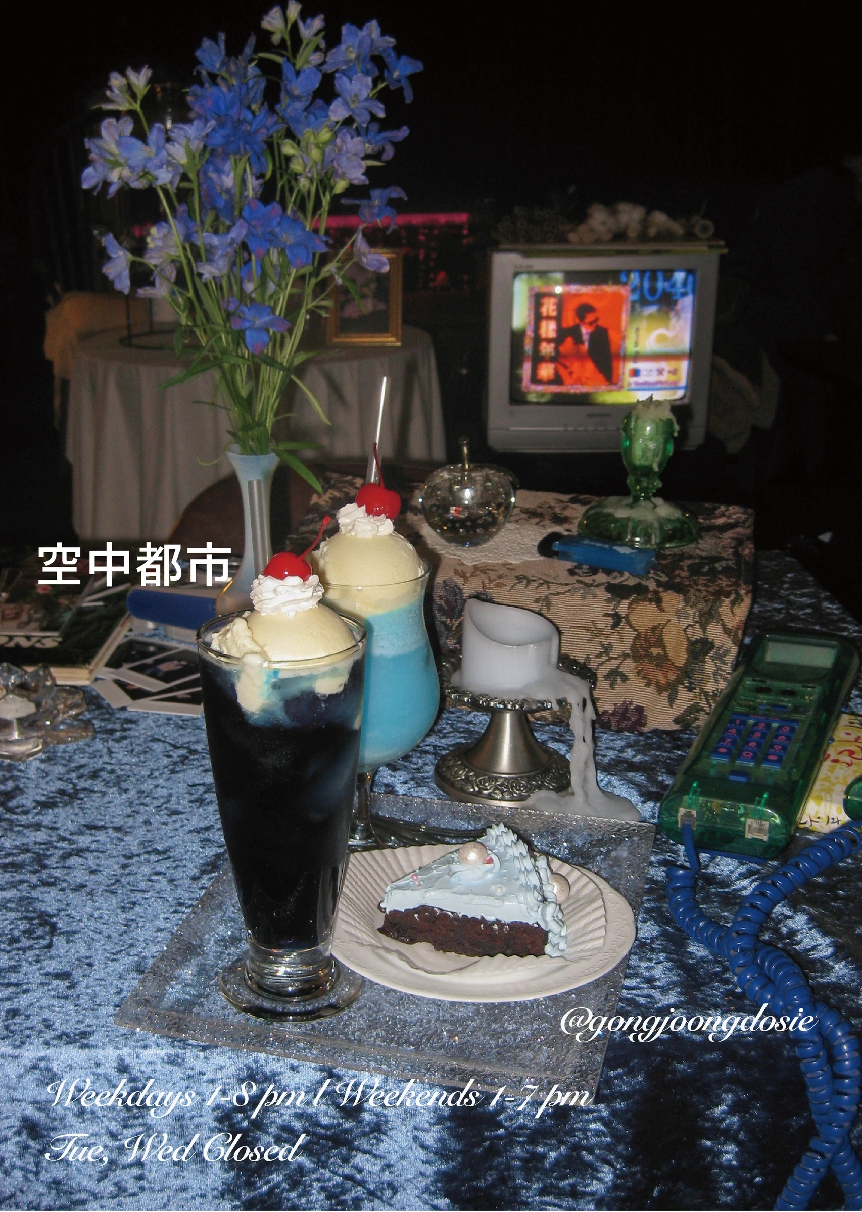
The photography poster for waiting zones.
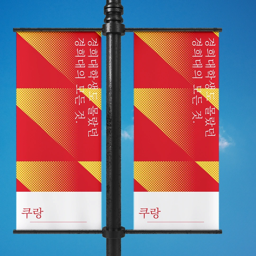
Khurang is an online community service for Kyung-Hee University in South Korea. Identity design follows the symbolic color of the school, and used geometric shape of the Korean syllables.

End-credit design for Fifty Fifty, using deliberate type selection, centered composition, and optical adjustments to give dense contributor credits a clear, balanced hierarchy. Round symbols replace commas as a subtle reference to bubbles.
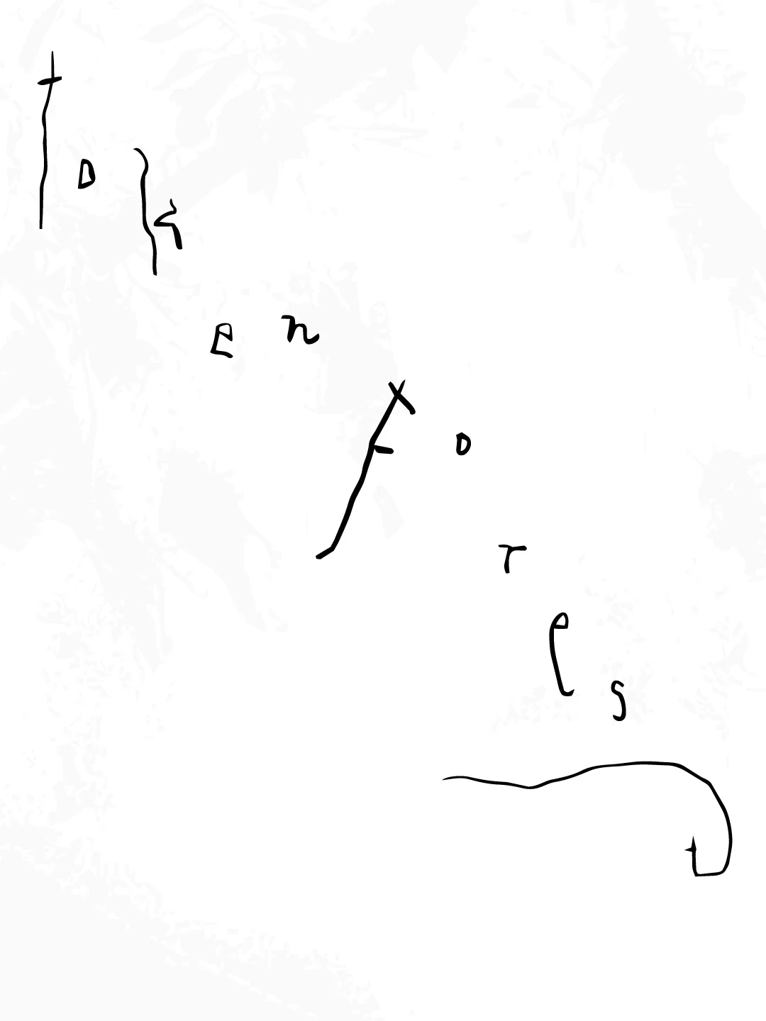
A lettering experiment began with the idea, “We once lived among trees. Soon, we may live among tokens.” Under the shared theme Token Forest, IIE exchanged perspectives on AI and translated them into a range of lettering concepts.

Rather than illustrating nature literally, the work uses material, scale, colour, and shadow to draw quieter parallels between product forms and natural scenes. Styling, image selection, and retouching were shaped as one visual language, balancing precise product information with a more immersive, editorial mood. Across campaigns, product pages, and social content, the resulting images give Sumsei a consistent way to translate everyday objects into invitations to remember nature.
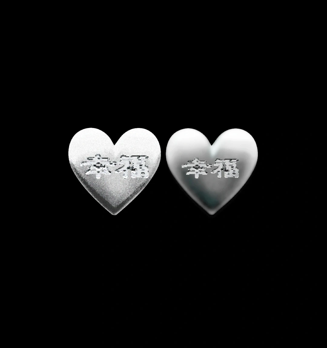
Wishing for it to remain unchanged, I envisioned it in the form of metal. Identity design for online shop covering merchandise items of Gongjoongdosie.

Graphic design for anniversary of the crew with an illustration of the statue standing with R93’s signature hand-sign pose. As an object, a statue carries the idea of remembering and commemorating the passage of time.
An annual archive for Sumsei, combining textured paper, hardcover binding, black and silver foil, and silver spot-color printing. The cover takes the form of a filed record: a clean white surface, and small typographic cues that reveal themselves on closer inspection. Textured paper, hardcover binding, black and silver foil, and silver spot-color printing extend this sense of collectability.
End-credit design for Fifty Fifty, using deliberate type selection, centered composition, and optical adjustments to give dense contributor credits a clear, balanced hierarchy. Round symbols replace commas as a subtle reference to bubbles.
Business card and typography setting for Studio GA.ZE. Printed identity application, typographic layout, information hierarchy, paper texture, and tactile brand expression.
Graphic design for merchandise item of Gongjoongdosie. 10 stamp-sized glitter coated sticker pieces were arranged within a frame shaped like a roll of film. They were designed as small keepsakes, preserving the space’s cinematic, film-like moments.
Paper stock and print production were considered as part of the design rather than a finishing step. A business card for Sumsei, balancing typographic density, the proportions of empty space, and the feel of paper to express the brand’s sensitivity to detail.
Wishing for it to remain unchanged, I envisioned it in the form of metal. Identity design for online shop covering merchandise items of Gongjoongdosie.
The photography poster for waiting zones.
13 words were chosen that are related to the town, and edited into graphic using the initial consonant of the word in Hangeul, Korean letter.
The identity for Gongjoongdosie began with the afterimage of the place—dark wood, glassware, curtains, goldfish tank, an old television, and vintage records. A hand-scripted Roman wordmark was inspired by the bronze objects and curved furniture in the space, referencing classic European Art Nouveau style. The vertical Hanja mark was developed from Hong Kong films and early digital devices, evoking the atmosphere of being in the midst of an old film scene. Together, these two visual languages turn a visit to the cafe into a cinematic experience, where every object becomes part of the mise-en-scène and every visitor a character within it.
Film photography printed on chiffon fabric. Merchandise item for Gongjoongdosie.
A lettering experiment began with the idea, “We once lived among trees. Soon, we may live among tokens.” Under the shared theme Token Forest, IIE exchanged perspectives on AI and translated them into a range of lettering concepts.
A pop-up space for Gongjoongdosie, translating eclectic atmosphere into a temporary setting through vintage furniture, found objects, graphic signage, and merchandise display.
A5-sized mini photo lookbook of Gongjoongdosie, composed from film photographs of the cafe interior space.
Decorative poster design for entrance of the cafe.
Graphic design for anniversary of the crew with an illustration of the statue standing with R93’s signature hand-sign pose. As an object, a statue carries the idea of remembering and commemorating the passage of time.
Khurang is an online community service for Kyung-Hee University in South Korea. Identity design follows the symbolic color of the school, and used geometric shape of the Korean syllables.
Graphic design on color lighter merchandise. UV print on plastic surface.
A website design contribution for Somaon Yoga. A warm neutral palette, restrained typography, and generous spacing create a visual rhythm that mirrors the focus and unhurried pace of practice. Built as a flexible system of typographic rules, module components, and visual guidelines, the site creates a clear and consistent home for Somaon’s evolving practice.
A concept identity for FOLKES, incorporating ginkgo leaf forms into the stems of a serif wordmark and its accompanying symbol to frame contemporary craft through the sensibility of autumn. Started visualizing the brand by setting the concept of “Select shop founded by novelist”. Offering unique collection of props curated globally, the brand brings handcrafted objects made from natural materials and traditional techniques, curated by novelist. A logo for FOLKES was designed with the theme of balancing refined curves with crisp serif edges and ginkgo-inspired split terminals. Natural forms soften the wordmark’s structure, lending it an understated elegance with a subtle, classic French sensibility.
Rather than illustrating nature literally, the work uses material, scale, colour, and shadow to draw quieter parallels between product forms and natural scenes. Styling, image selection, and retouching were shaped as one visual language, balancing precise product information with a more immersive, editorial mood. Across campaigns, product pages, and social content, the resulting images give Sumsei a consistent way to translate everyday objects into invitations to remember nature.
Inspired by Polaroids, photocard frames, and Tamagotchi-like proportions, the website reflects Yukiya’s playful character. A muted color palette conveys its quiet, innocent inner world through web interface design, interaction concept, and photography direction.
Poster design for outdoor signage of Gongjoongdosie.
Typographic poster series honoring Emil Ruder, 20th century typography designer. Quoted texts from the book "Design is Attitude" by Helmut Schmid, student of Ruder.