kimdeokhwan3@gmail.com
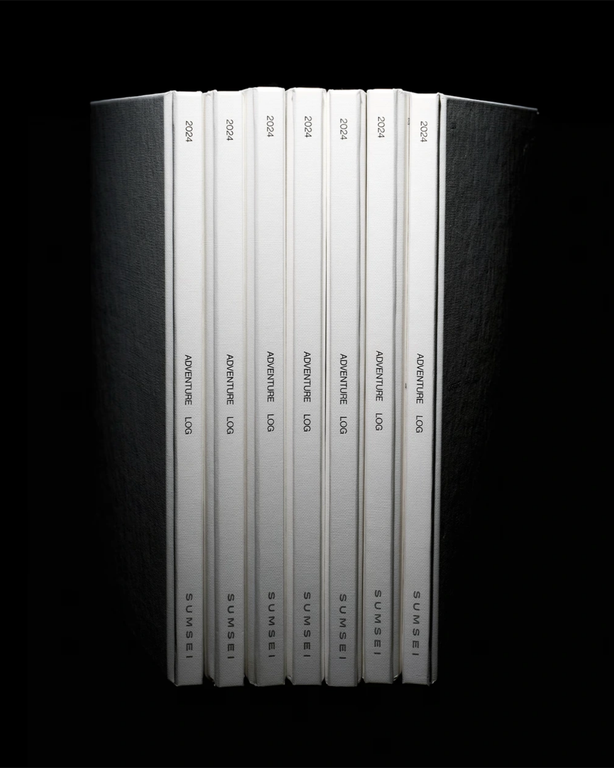
An annual archive for Sumsei, combining textured paper, hardcover binding, black and silver foil, and silver spot-color printing in a record of the brand conceived to be kept.

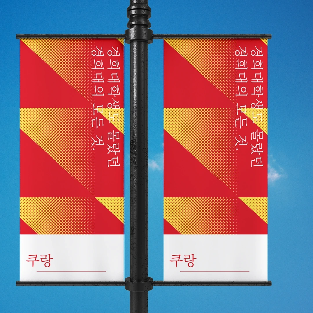
Graphic design & development of merchandise items for the cafe.
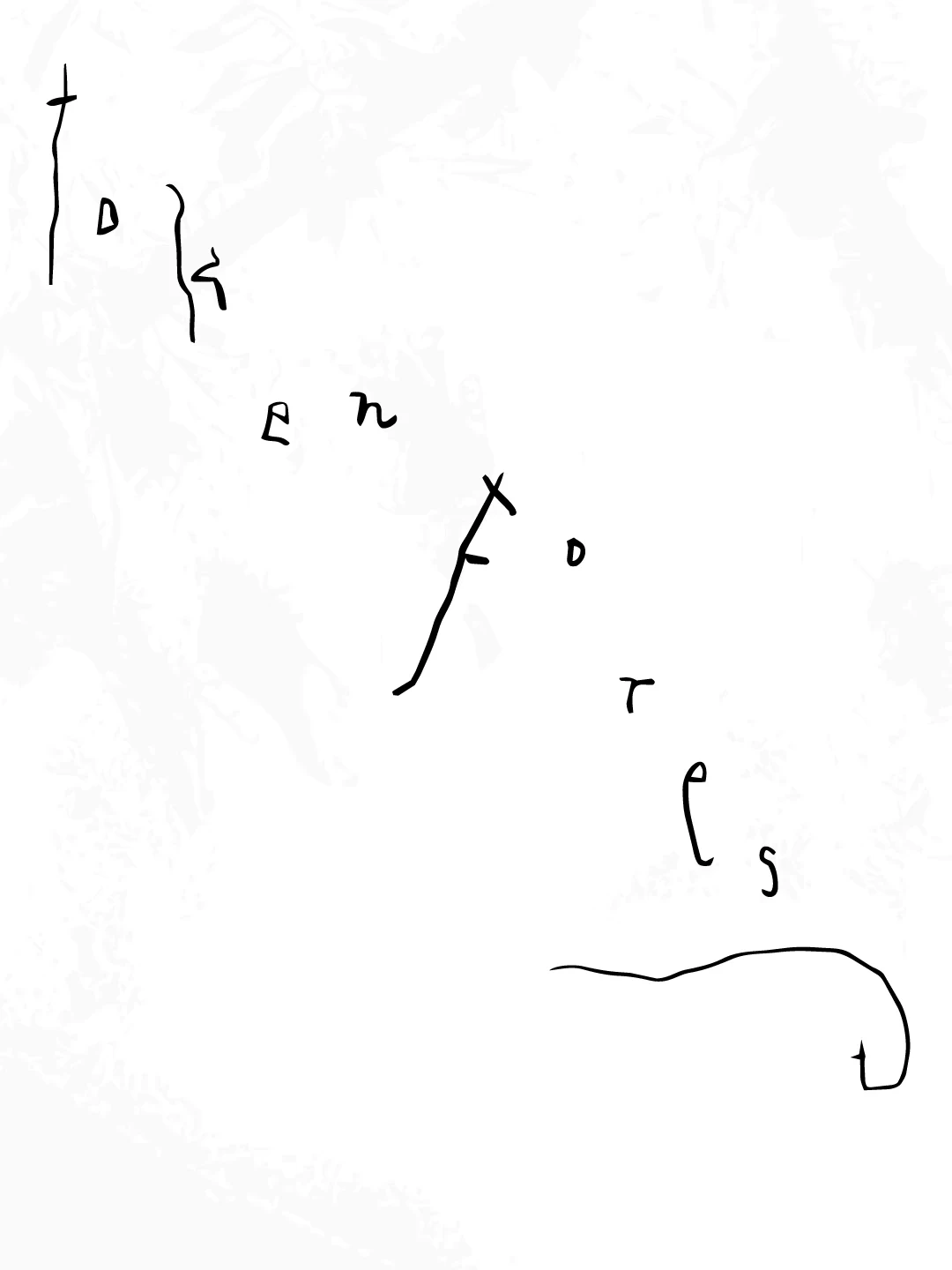
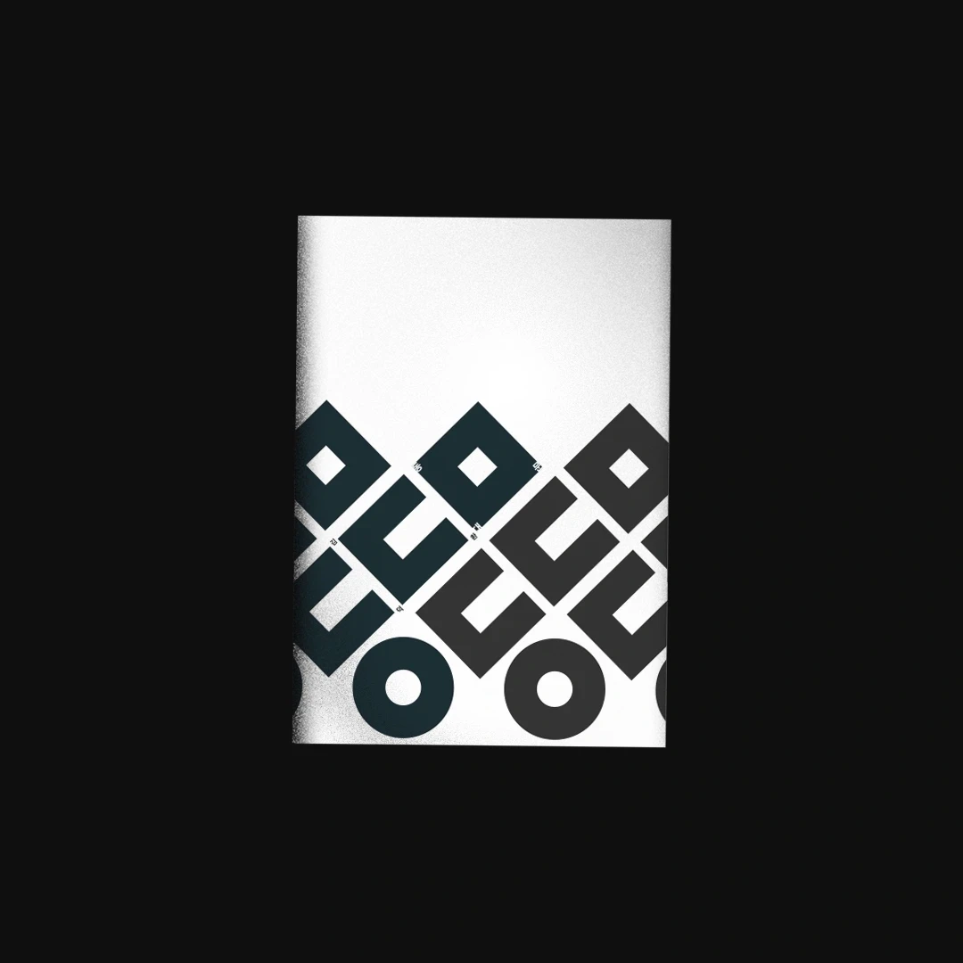
A lettering experiment translating the curves and line textures of elm stems, leaves, and seeds into letter structures to explore the relationship between nature and digital language.
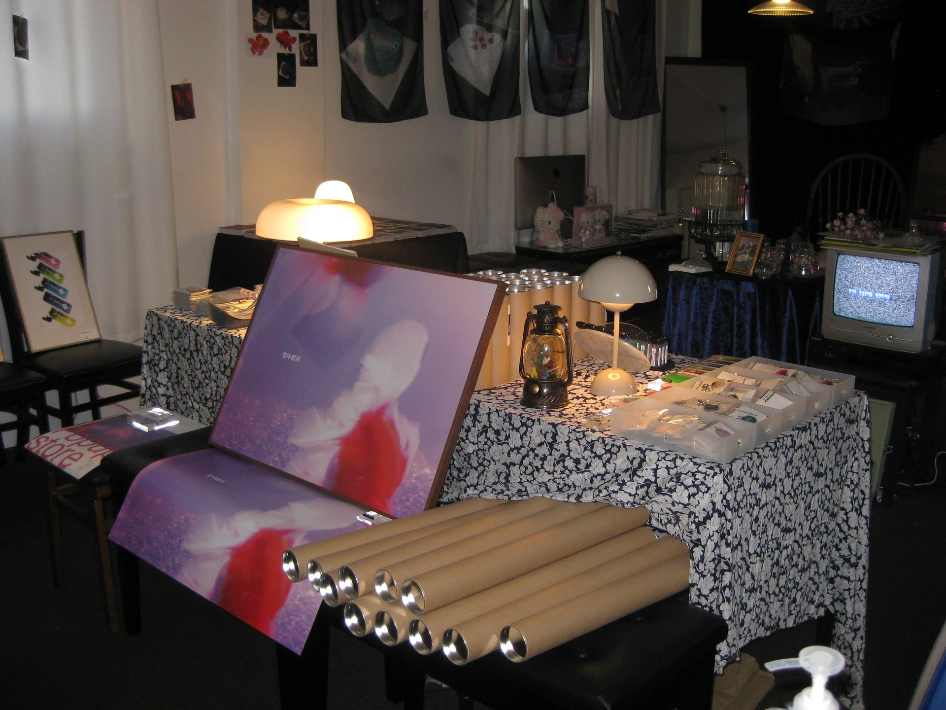
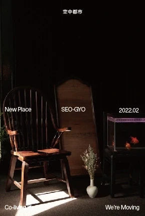
A pop-up space for Gongjoongdosie, translating the café’s eclectic atmosphere into a temporary setting through vintage furniture, found objects, graphic signage, and merchandise display.

A business card for Sumsei, balancing typographic density, the proportions of empty space, and the feel of paper to express the brand’s sensitivity to detail.
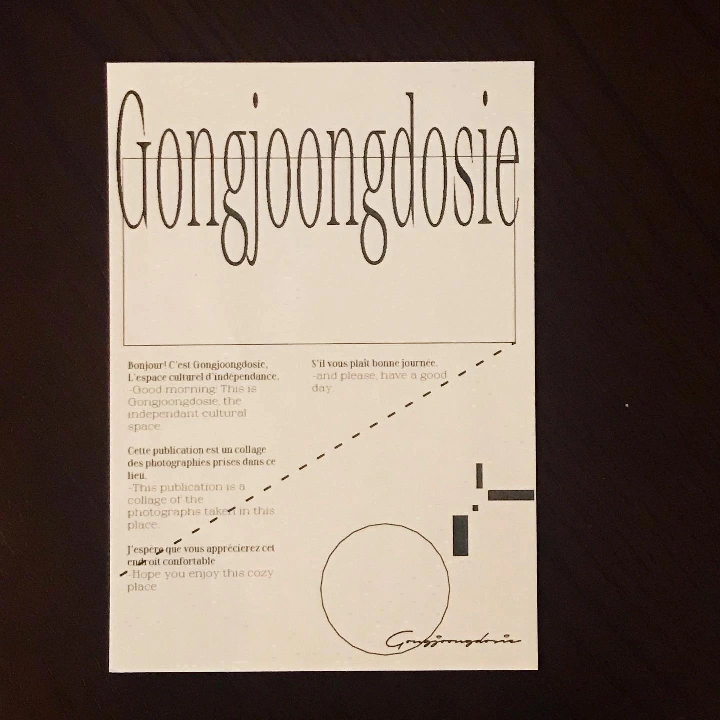
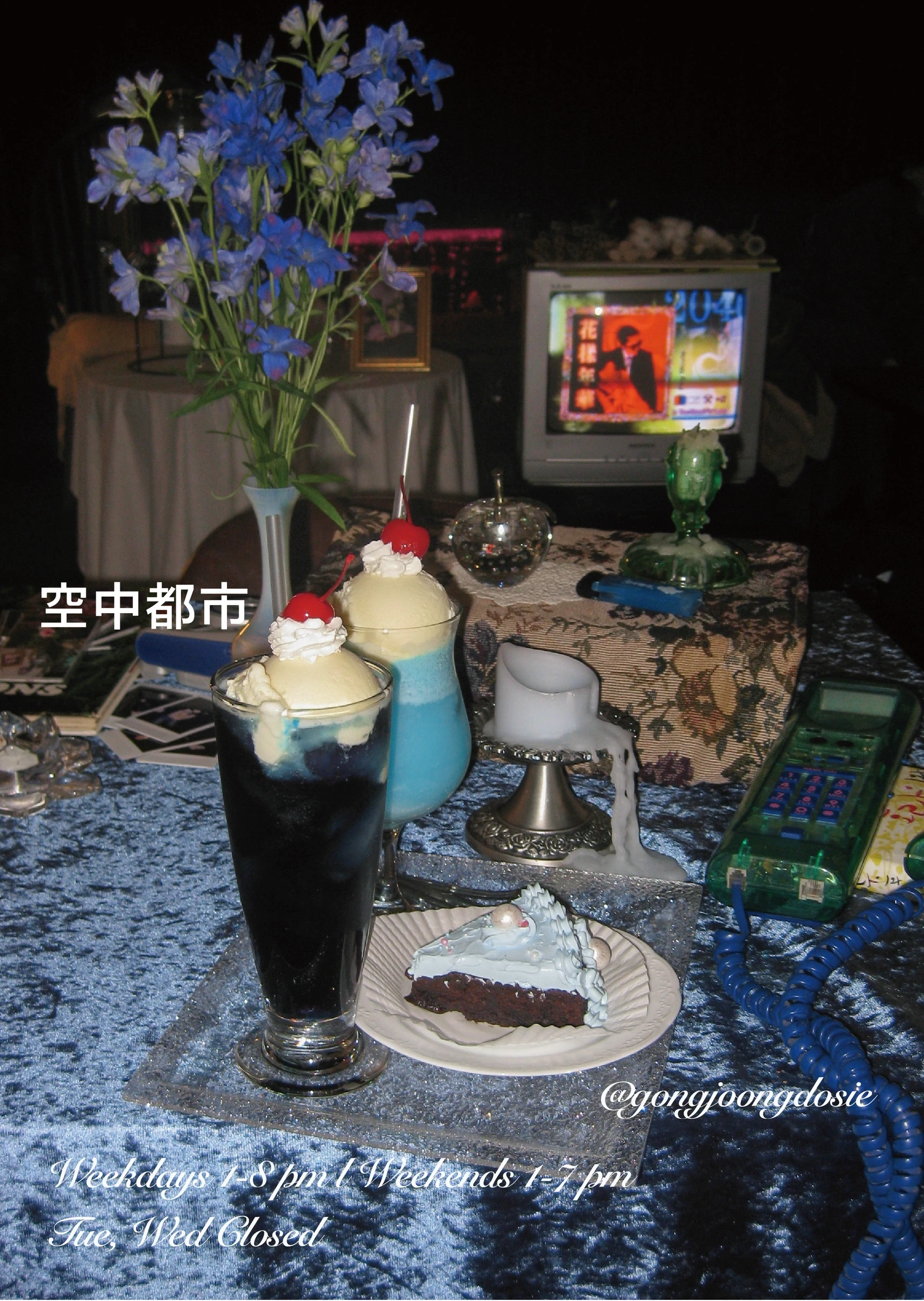
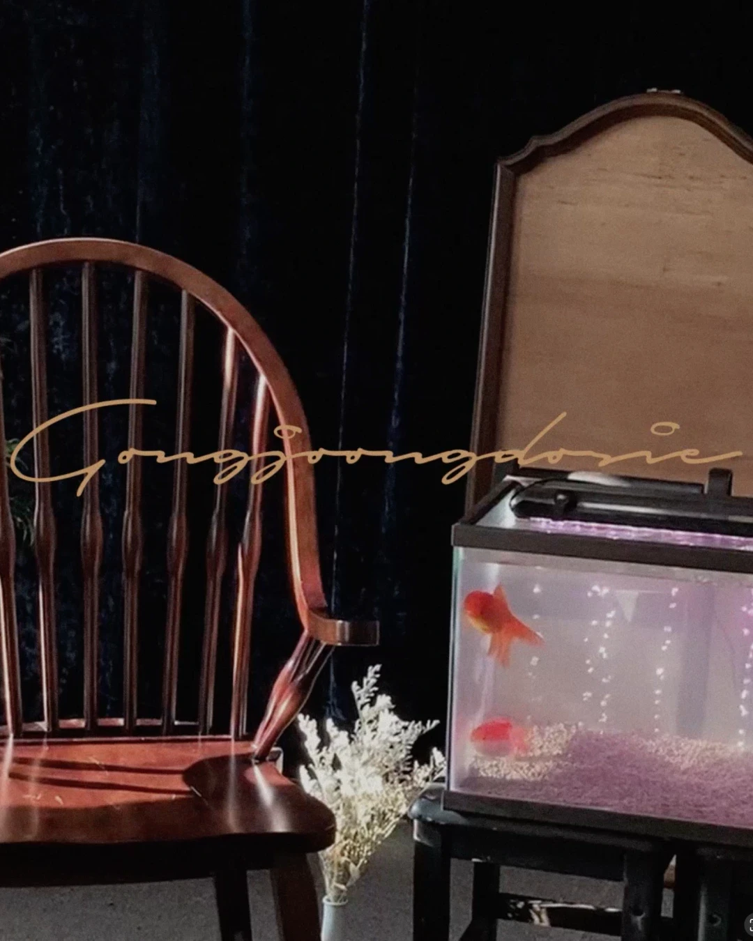
An identity for Gongjoongdosie, carrying the atmosphere of a goldfish tank, an old television, and vintage records through its logo, menus, signage, and photography to evoke the setting of an old film.

Graphic design & development of merchandise items for the cafe.

Business card and typography setting for Studio GA.ZE. Printed identity application, typographic layout, information hierarchy, paper texture, and tactile brand expression.
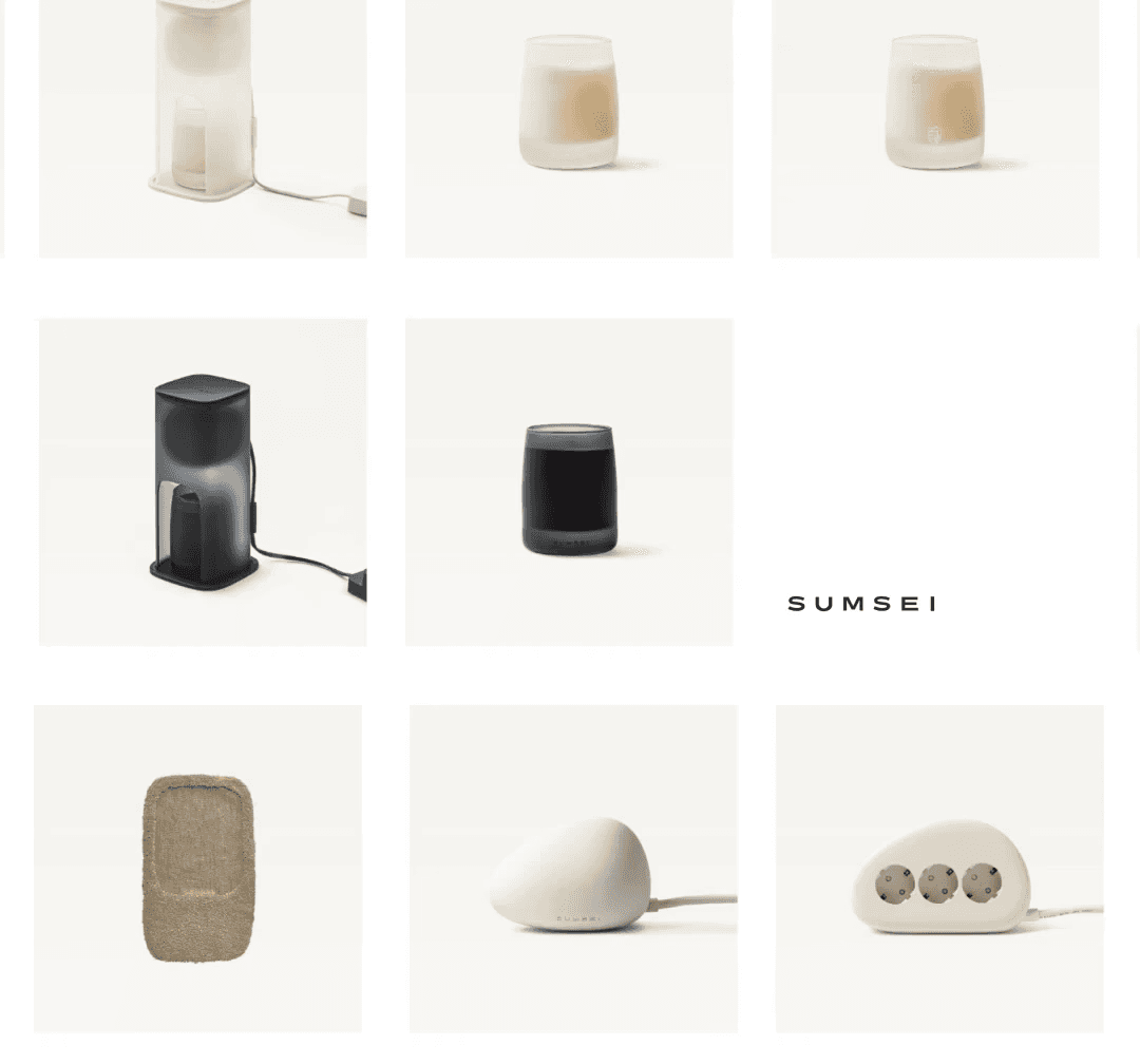
Image direction for Sumsei, coordinating camera angles, backgrounds, and color to reveal product forms and materials alongside natural surfaces. Visual storytelling that brings sensations of nature to everyday objects.
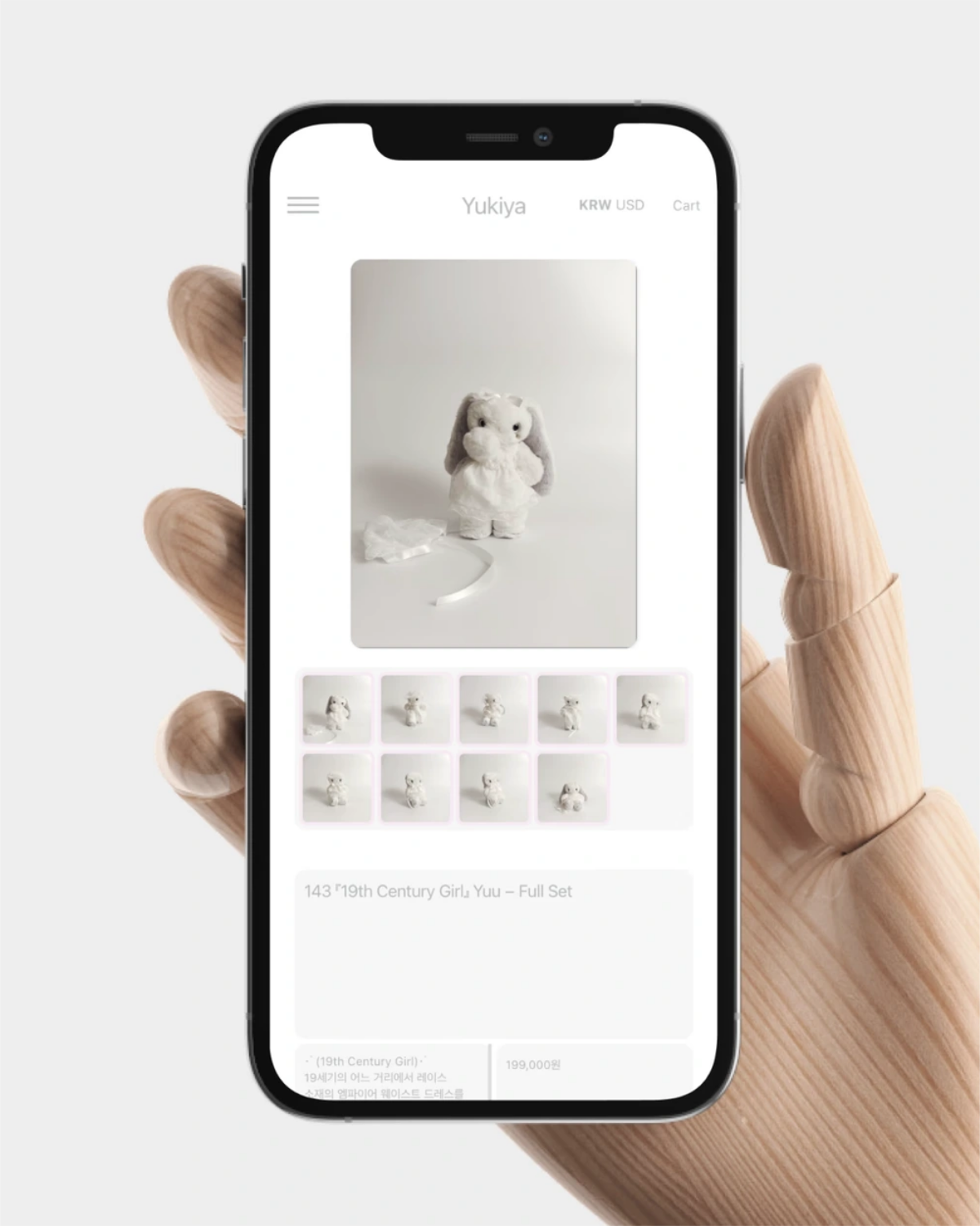
Playful web interface design contribution for Yukiya. Website design, mobile layout, interaction concept, and visual direction inspired by Polaroids, photocard frames, and Tamagotchi-like proportions.

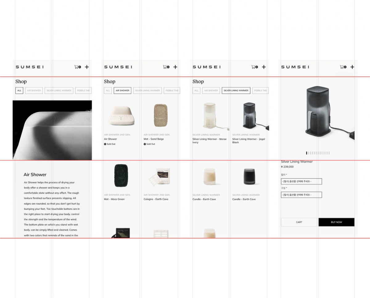
Digital brand experience for Sumsei. Web renewal, interface design, content structure, product storytelling, and publishing.

A website design contribution for Somaon Yoga, combining warm ivory tones, generous spacing, and a clear typographic hierarchy in reusable modules that make its expertise feel approachable.
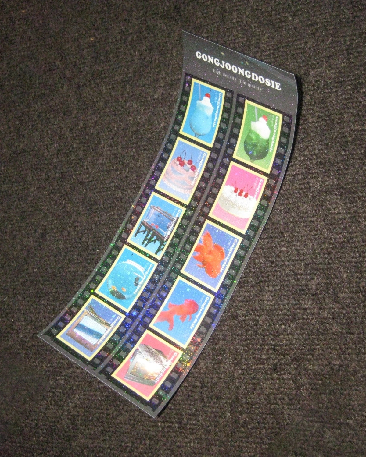
Graphic design & development of merchandise items for the cafe.
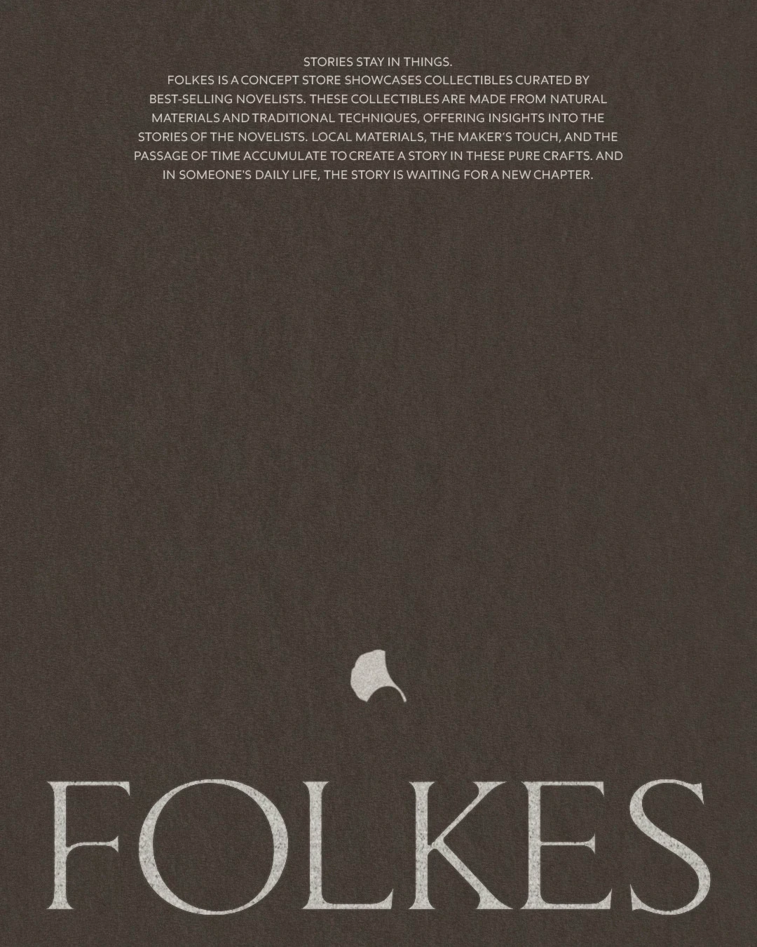
A concept identity for FOLKES, incorporating ginkgo leaf forms into the stems of a serif wordmark and its accompanying symbol to frame contemporary craft through the sensibility of autumn.
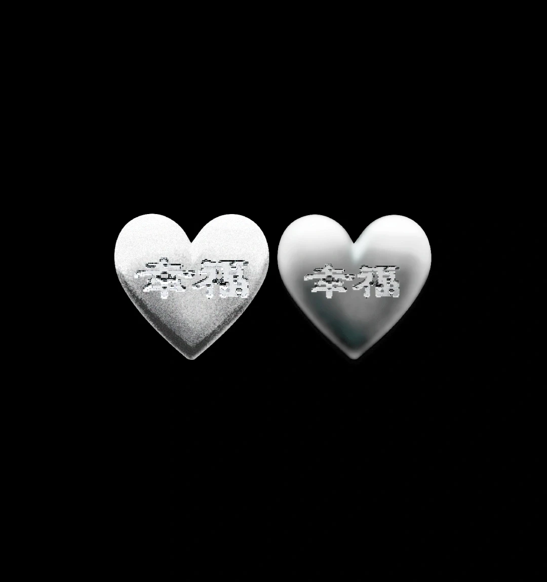
Wishing for it to remain unchanged, I envisioned it in the form of metal.

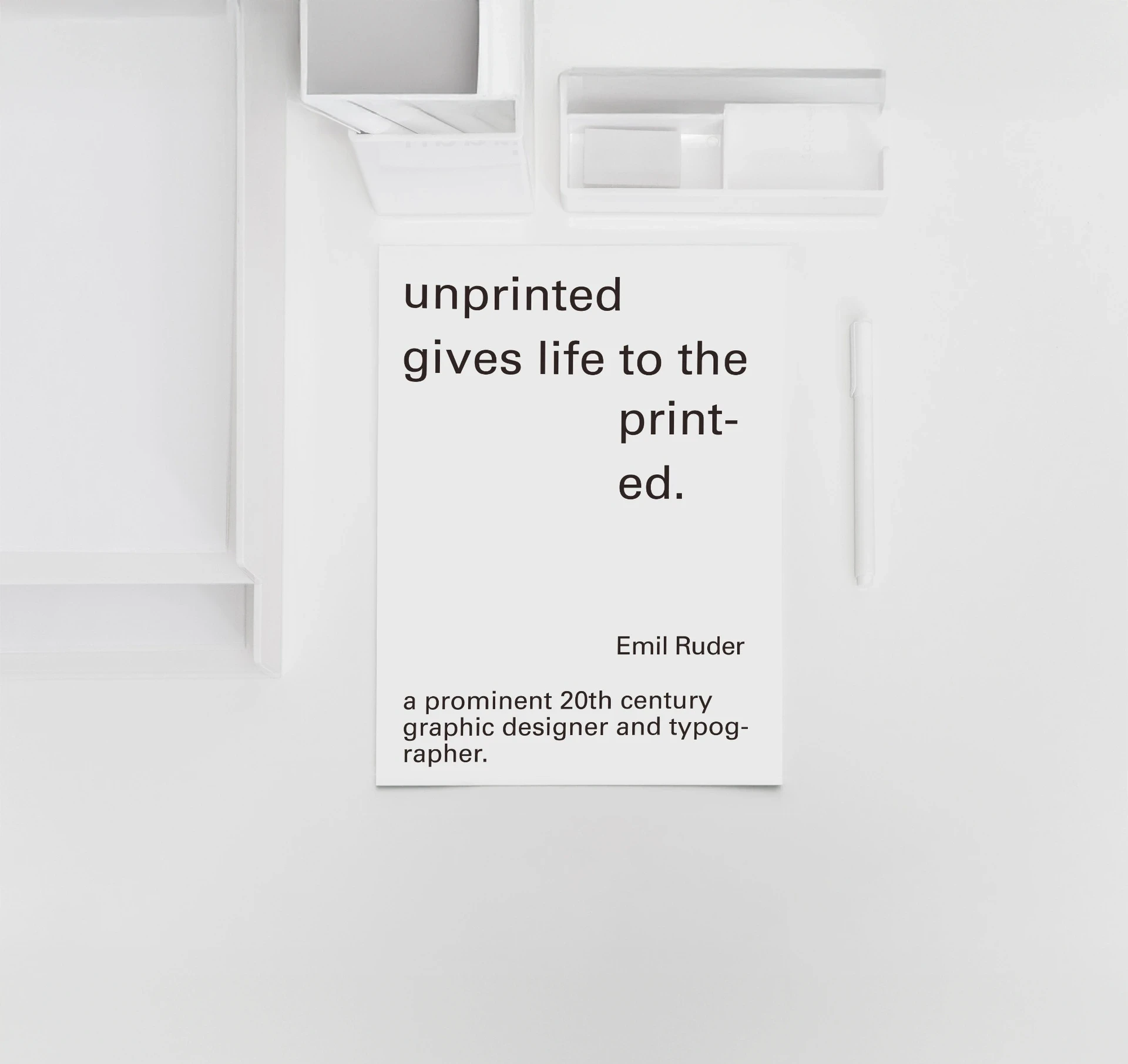
An annual archive for Sumsei, combining textured paper, hardcover binding, black and silver foil, and silver spot-color printing in a record of the brand conceived to be kept.
Graphic design & development of merchandise items for the cafe.
Graphic design & development of merchandise items for the cafe.
A business card for Sumsei, balancing typographic density, the proportions of empty space, and the feel of paper to express the brand’s sensitivity to detail.
An identity for Gongjoongdosie, carrying the atmosphere of a goldfish tank, an old television, and vintage records through its logo, menus, signage, and photography to evoke the setting of an old film.
A website design contribution for Somaon Yoga, combining warm ivory tones, generous spacing, and a clear typographic hierarchy in reusable modules that make its expertise feel approachable.
A pop-up space for Gongjoongdosie, translating the café’s eclectic atmosphere into a temporary setting through vintage furniture, found objects, graphic signage, and merchandise display.
Playful web interface design contribution for Yukiya. Website design, mobile layout, interaction concept, and visual direction inspired by Polaroids, photocard frames, and Tamagotchi-like proportions.
Digital brand experience for Sumsei. Web renewal, interface design, content structure, product storytelling, and publishing.
A lettering experiment translating the curves and line textures of elm stems, leaves, and seeds into letter structures to explore the relationship between nature and digital language.
Image direction for Sumsei, coordinating camera angles, backgrounds, and color to reveal product forms and materials alongside natural surfaces. Visual storytelling that brings sensations of nature to everyday objects.
Wishing for it to remain unchanged, I envisioned it in the form of metal.
Graphic design & development of merchandise items for the cafe.
Business card and typography setting for Studio GA.ZE. Printed identity application, typographic layout, information hierarchy, paper texture, and tactile brand expression.
A concept identity for FOLKES, incorporating ginkgo leaf forms into the stems of a serif wordmark and its accompanying symbol to frame contemporary craft through the sensibility of autumn.